


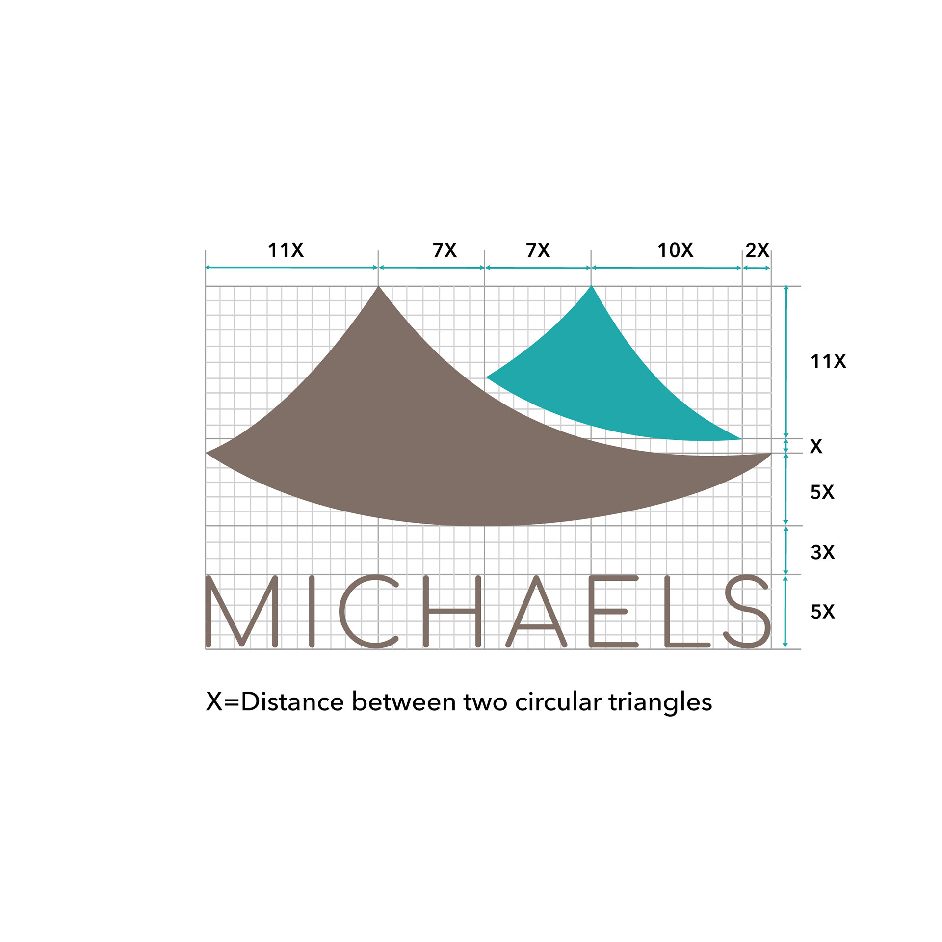
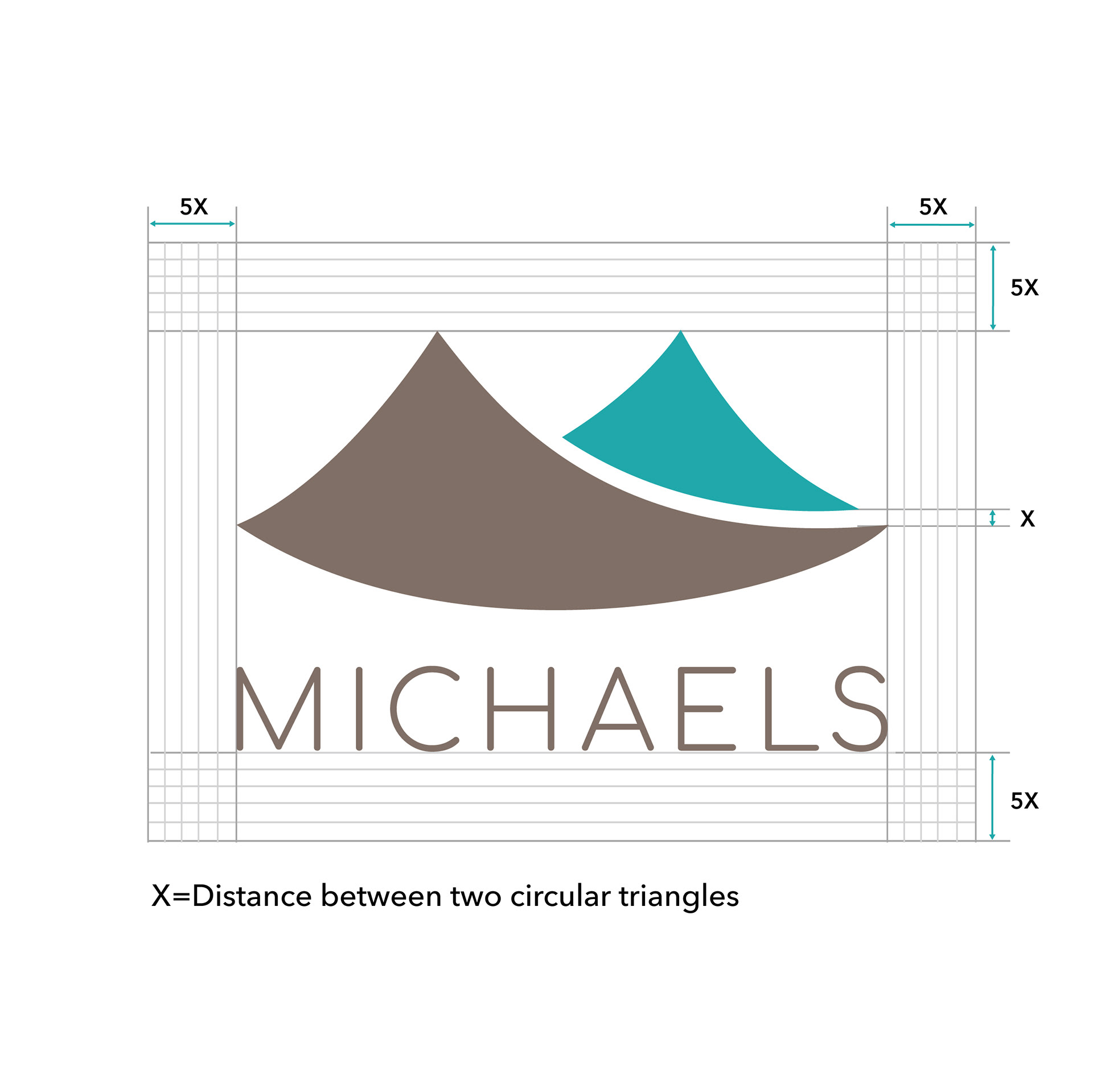
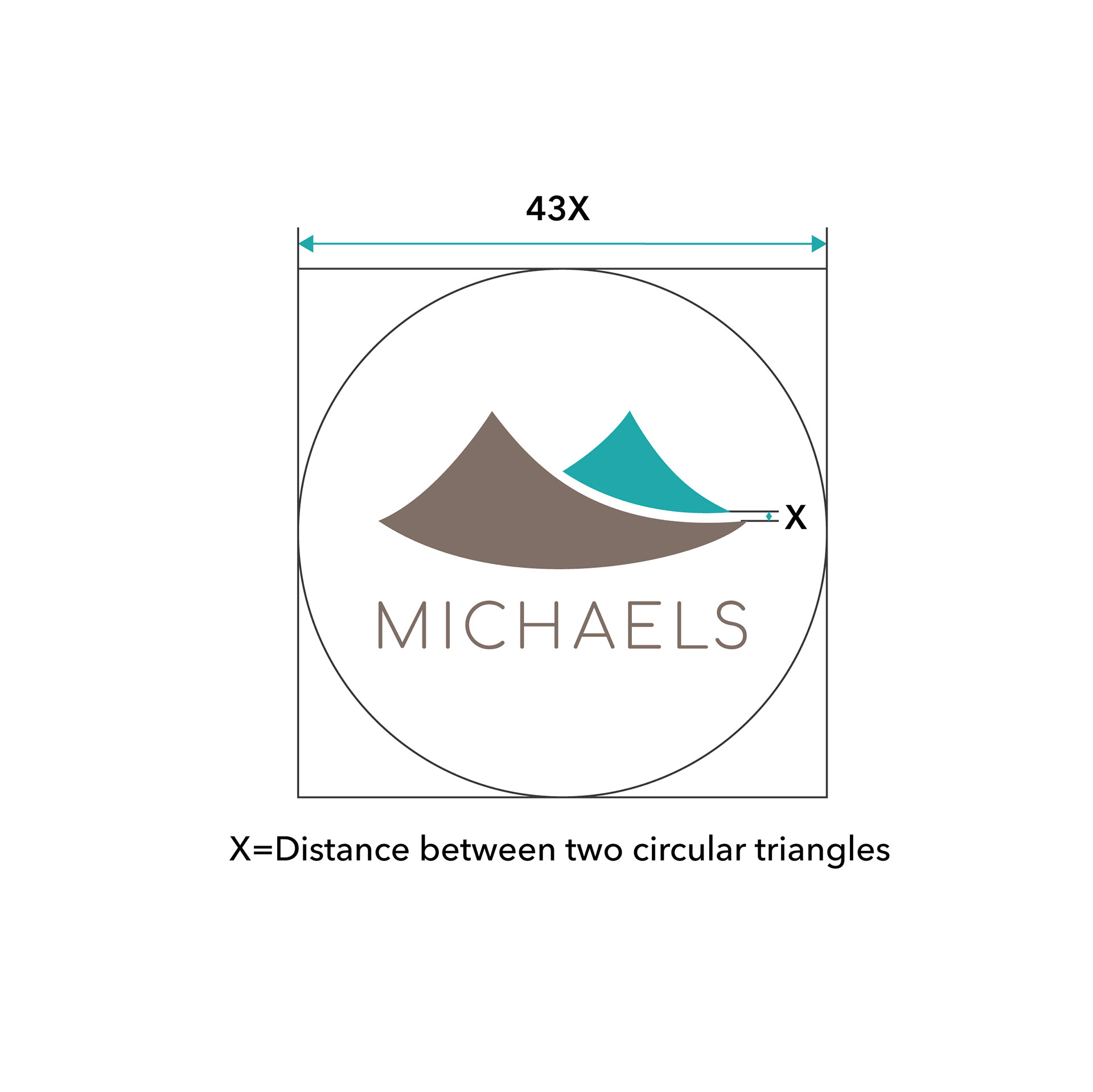

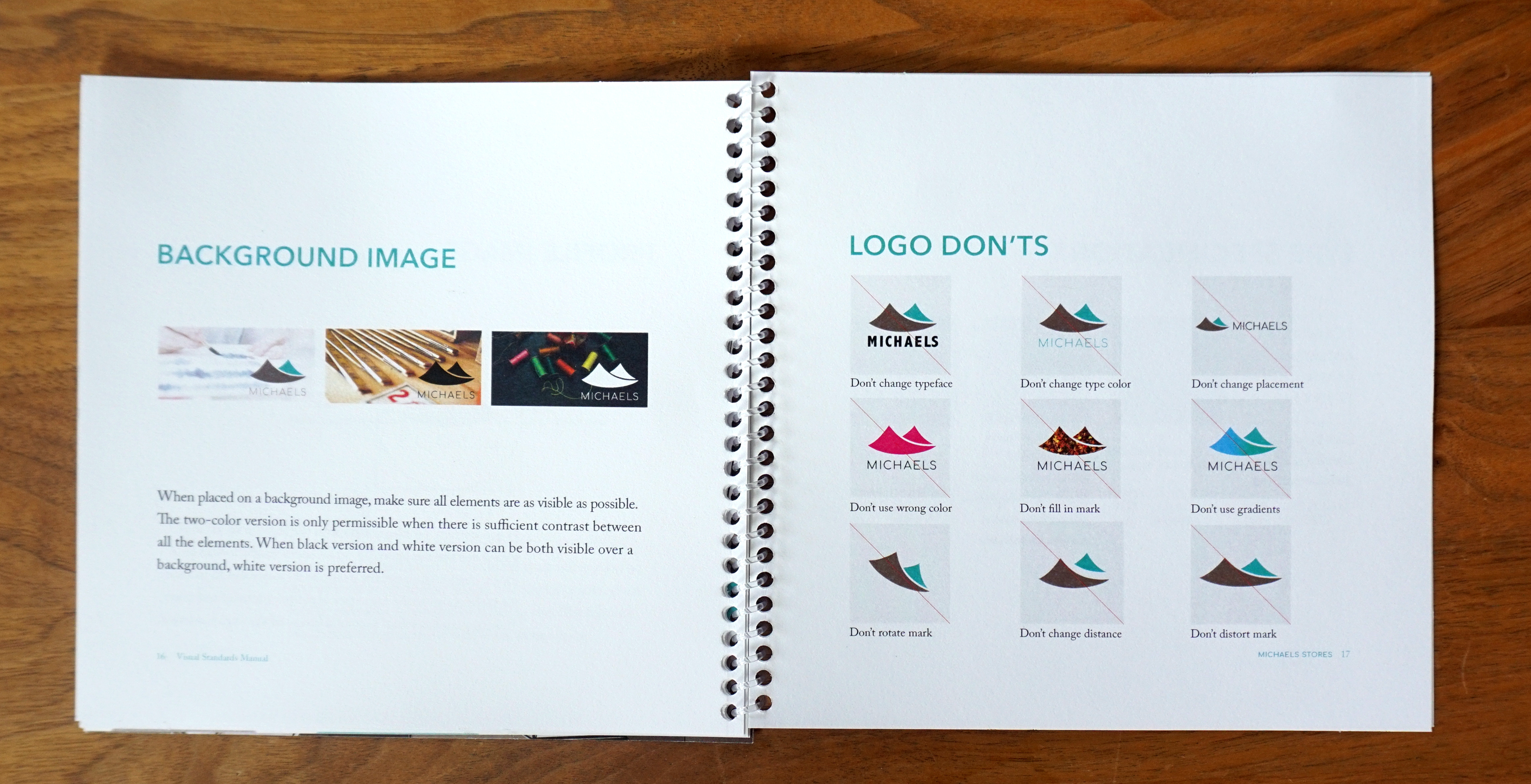
The redesign of Michaels is to create a branding that truly represents its tagline, Make Creativity Happen. It was also designed to be more inviting for male customers as well as younger shoppers. So the overall image is less feminine and more modern. The logo is inspired by the craft paper sold at the store. The mark is a combination of two circular triangles. It is shaped like letter M as well as wings. This represents the store name and creativity. The logo is a universal signature intended to be used across all communications.